Article
Hint.css — pure CSS tooltips
While browsers have built-in support for tooltips, which can be added by setting the 
 You can tweak the tooltip appearance by adding these classes:
title attribute, unfortunately, such tooltips don't look good and have a long delay before they appear. There are many JavaScript libraries for better looking and better behaving tooltips, for example, Bootstrap includes one. It turns out, though, that you can implement them with CSS alone, and that's what Hint.css does.
What is Hint.css?
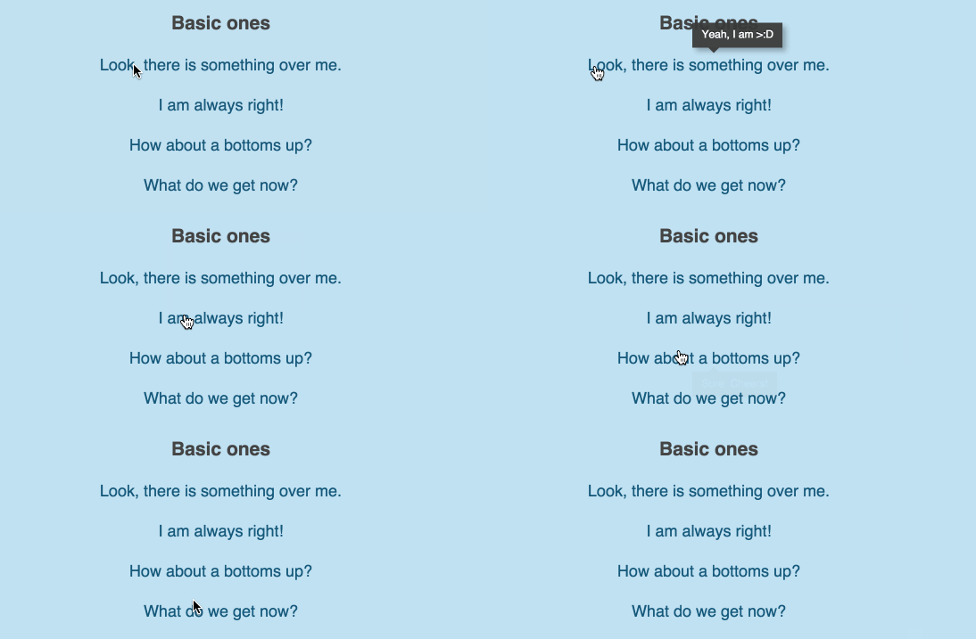
Hint.css is a pure CSS tooltip library. It provides beautiful tooltips with nice animations without using JavaScript. Tooltip properties are controlled via data-* attributes that you set on DOM elements. They support different positioning: left, right, top, bottom; various appearances: info, warning, success, error; rounded corners. You can also turn off animation or tweak it to be "bouncy".
Getting Hint.css
You can download Hint from GitHub: full, minified. Alternatively, you can use Bower front-end package manager to install it:bower install hint.css
<link rel="stylesheet" href="hint.css">
Using Hint.css
To set a tooltip for an element, add one of the position classes to it:hint--top, hint--bottom, hint--left, or hint--right, and put tooltip text into data-hint attribute:
My name is <span class="hint--bottom" data-hint="James Bond">Bond</span>.
 You can tweak the tooltip appearance by adding these classes:
hint--error— gives "error" color (red by default)hint--info— gives "info" color (light blue by default)hint--warning— gives "warning" color (golden by default)hint--success— gives "success" color (green by default)hint--always— defines a persisted tooltip which is always shownhint--rounded— makes tooltip corners roundedhint--no-animate— turns off tooltip animationhint--bounce— turns on bouncing type of animation
